In ManageByStats we have two sections where statistical information is displayed; the Stats page and the Graphs page. The Graphs page is visual, whereas the Stats page shows numbers in columns and rows – similar to spreadsheet style presentations. While both sections are getting their information from the same source, however, there’s a subtle difference in what information is displayed in each area.
The Stats page is purely financial. Here’s where you see your sales data sorted by statement or date ranges, viewed by SKUs, Brands, Product Names and ASINs. These figures all have to do with finalized sales, as Amazon does not provide the detailed finance data on Pending transactions. What you see on the Stats page, then, are sales figures; orders that have been finalized and the sale complete. Quantities on the Stats page, for example, are quantities for items that have been processed through to a completed sale, not just ordered.
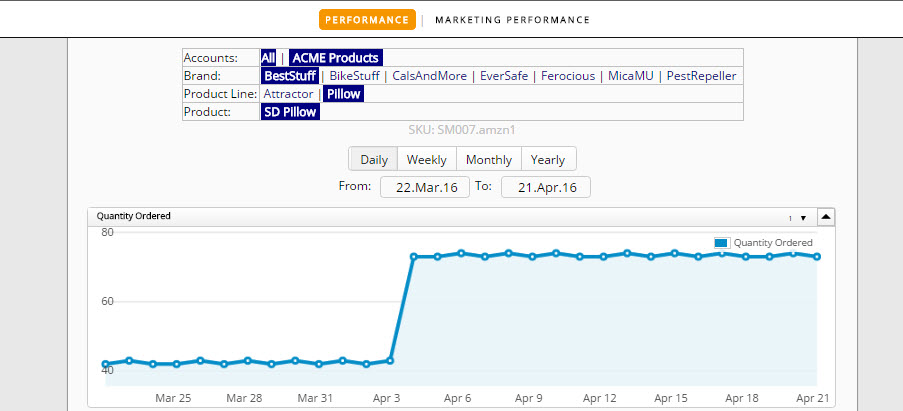
On the Graphs page we see info that is not just financial. Specifically orders, and when looking at the graphs you can see how many orders were placed for any given day or period, which includes Pending orders. Not all info available under Graphs is financial (the payments haven’t yet finalized), but it is important data as to how many orders have been placed.
The important distinction here between the two areas is that there is no information included on the Stats page that does not have to do with a finalized and settled transaction, whereas in the Graphs section there can be information included that does not have to do with finalized transactions.
And so that’s the difference between the two. Stats are solely financial, Graphs have financial info along with other information.
Today’s installment was short. Once again we appreciate you taking the time to listen as we spool out another little bit of the ManageByStats saga. More to come in future segments.
Have a great day.
